Scaling the House through Jan. 2018
The most recent post on Poole’s Voteview blog warned of “possible big trouble ahead.” Cause for this warning was an “unprecedented collapse of the long-term structure of Congressional Voting during the past 20 years.” To back up the claim, Hare and Poole graphed model-fit statistics for optimal-classification scalings of each House session, 1789-2015. At the time of the original post, the need for more than one dimension had steadily declined since the mid-1970s. In earlier years, a second dimension improved model fit for certain issues, recent examples being gun control and abortion. One interpretation is that some Republicans had been liberal, at least on certain issues, and some Democrats conservative — and their roll-call voting reflected this.
This post updates the earlier one through January 22, 2018. I am pleased to report (depending on your preference for party government) that a one-dimensional model better explains voting in the House of Representatives than at any point in American history.
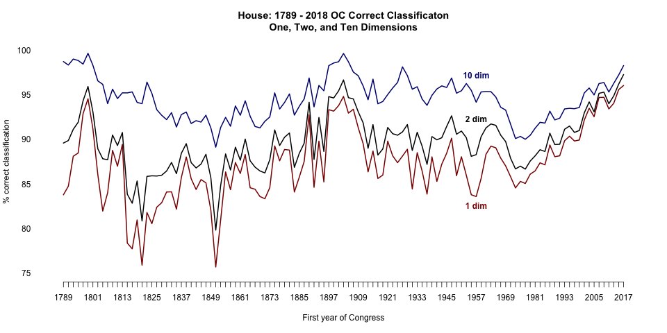
Here you see the percentage of votes correctly classified in 1, 2, and 10 dimensions, per the original post. One-dimensional correct classification was 96 percent as of 1/22/18, an all-time high.
 And here you see the aggregate proportional reduction in error (APRE), a model-fit statistic that weights classifier performance by ease of the task (i.e., the lopsidedness of a roll-call vote). One-dimesional APRE was 0.9 as of 1/22, another all-time high.
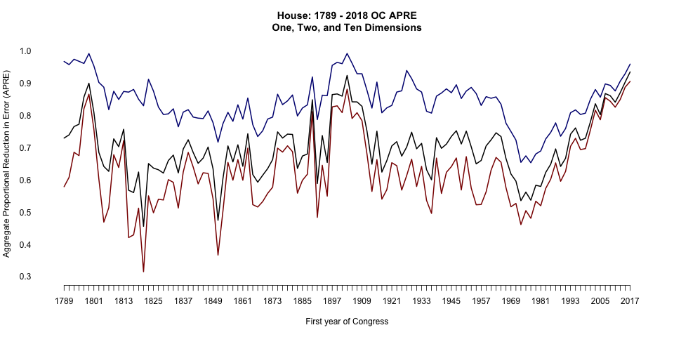
 Two years ago, some wondered whether 2016 would become a high-water mark for polarization. Strictly speaking, these fit statistics don’t measure polarization (as a distance between parties), but they are consistent with party coalitions that continue to be rigid.
Thanks to Jeff Lewis at Voteview for making the underlying data available, and thanks to Chris Hare for the earlier analysis.