Skip to content

Teaching Shefter (1986) in November 2023

I just finished teaching/discussing a classic article on NYC party politics in the 1920s-50s. It was an interesting coincidence that the Working Families Party had just done well the day before in some Northeastern cities. (The Libertarians also did well, but that is a potential connection for later.)

Shefter’s piece is not easy to read. It was one of the first to run in Studies in American Political Development. The theory casts “political incorporation” and “extrusion” as “two sides of the same coin” of the handling of “new social forces” in American politics. All these terms need interpreting.

The argument also rests on details about many forgotten local politicians. That is a lot to keep track of. It also mentions interest groups, both formal (like the Citizens Union) and informal (like the mafia).

I taught the piece with pictures of the underlying coalition structure, light discussion of the electoral institutions, and a bit on the then-emerging New Deal party system. (The other key part of the theory is a “crisis” or “realignment” in/of the party system.) Then we interpreted the key terms. Then I had students look up names from the article (La Guardia, Marcantonio, O’Dwyer, Powell, etc) and try to say how their portrayals supported the theory.

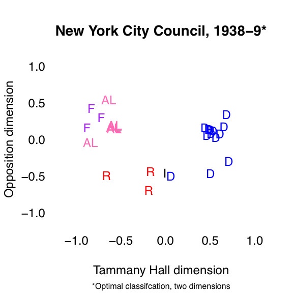
Here is the initial post-reform coalition structure. By reform I mean the institutional changes of 1936.

Here is the coalition structure as the institutions were about to change again.

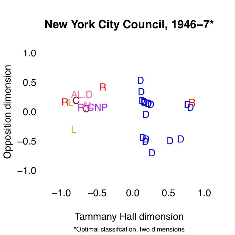
There are clear differences, and these mapped nicely onto details in the article.

The images are illustrative, not authoritative. I made them several years ago. The newer representation of these data was done instead by scaling everything together (due to the attendant research purpose).

I did not bring up the WFP at all. One student did mention AOC, and we discussed how well the framework fits her trajectory, which historical figure seems most similar, etc.

I have been thinking a lot about how all of the above relates to nationalization, as well as another book I look forward to reading on that.


Updating some U.S. House graphics

Now seems like a good time to remake some graphics I use often. All the underlying data are from Voteview.

Below is a party-blind measure of polarization in the U.S. House, from the beginning of that chamber through Wednesday of last week. The party-blind measure is the mean of all pairwise distances. (I once calculated it here for states and first came across it here.) This lets us go back to before the major parties were Republicans and Democrats. It also does not force us to make arbitrary decisions about handling minor parties, independents, and others with less common ways of affiliating/identifying.

Below is the more familiar measure: distance between the median members of the major parties, back to the end of Reconstruction. This plot includes the median Southern Democrat (conventionally the 11 Confederate states plus Kentucky and Oklahoma).

The last two plots answer the question: “How well does an N-dimensional model fit the data?” I used the optimal classification algorithm to recover ideal points for each House. I did this one Congress at a time; see here and here for other options. The black line comes from one-dimensional models. The gray line comes from two-dimensional models. The first plot gives the percentage of votes correctly classified, by Congress.

The second plot gives the aggregate proportional reduction in error.

Here is a CSV of the fit measures above. The first two columns are for the one-dimensional models. The next two are for two dimensions.


Eleven Maine Democrats

At the same time that they use it in party primaries, Maine voters this June will vote a second time on retaining ranked-choice voting. This second referendum is the next stage of a people’s veto, a citizen-initiative process that can overturn acts of the legislature. The first stage was collecting more than 66,000 valid signatures, or 10 percent of votes cast in the last gubernatorial election.

What brought about the people’s veto was a classic, legislative roll. Last October 23, in a special session, eleven Maine Democrats joined their Republican colleagues to scuttle ranked-choice voting. This behavior was strange because the Democratic Party is poised to benefit, at least as public sentiment now stands.

Read more…


Scaling the House through Jan. 2018

The most recent post on Poole’s Voteview blog warned of “possible big trouble ahead.” Cause for this warning was an “unprecedented collapse of the long-term structure of Congressional Voting during the past 20 years.” To back up the claim, Hare and Poole graphed model-fit statistics for optimal-classification scalings of each House session, 1789-2015. At the time of the original post, the need for more than one dimension had steadily declined since the mid-1970s. In earlier years, a second dimension improved model fit for certain issues, recent examples being gun control and abortion. One interpretation is that some Republicans had been liberal, at least on certain issues, and some Democrats conservative — and their roll-call voting reflected this.

This post updates the earlier one through January 22, 2018. I am pleased to report (depending on your preference for party government) that a one-dimensional model better explains voting in the House of Representatives than at any point in American history.

Here you see the percentage of votes correctly classified in 1, 2, and 10 dimensions, per the original post. One-dimensional correct classification was 96 percent as of 1/22/18, an all-time high.

And here you see the aggregate proportional reduction in error (APRE), a model-fit statistic that weights classifier performance by ease of the task (i.e., the lopsidedness of a roll-call vote). One-dimesional APRE was 0.9 as of 1/22, another all-time high.

Two years ago, some wondered whether 2016 would become a high-water mark for polarization. Strictly speaking, these fit statistics don’t measure polarization (as a distance between parties), but they are consistent with party coalitions that continue to be rigid.

Thanks to Jeff Lewis at Voteview for making the underlying data available, and thanks to Chris Hare for the earlier analysis.